
A couple of weeks back, we wrote about e-commerce on mobile, and how important device-specific performance has become in terms of securing your users’ experiences and ultimately conversions. While this is key to e-commerce, it’s also important for any company doing business online.
Our partner, DeviceAtlas, a specialist firm focused on mobile device detection to provide optimal user experiences across devices, shared their insights on boosting web performance on mobile, explaining why adaptive design provides the kind of flexibility that today’s mobile web performance demands.
...
According to Cisco, the number of global mobile 4G connections will grow to 6.1 billion by 2021, proving that mobile connectivity is still very much in a growth phase. Device-focused web optimization is now more important than ever due to the growing variety of devices that connect to mobile networks and access online content. Here’s why adaptive design offers the most sophisticated and flexible optimization technique.
How fragmentation is changing today’s connective device landscape
Although you may think device diversity is slowing down, the opposite is true, as the number of connected devices grew rapidly over the last decade. Last year DeviceAtlas reported over 2,000 unique device models actively used for web browsing in a single quarter in the USA alone. These devices were made by 243 device makers, had 79 different screen dimensions, 24 different operating systems, and 23 mobile browsers. And that’s before we consider the huge spectrum of CPU and memory specs, 3G, 4G and WiFi support and availability.
While the myth that any smartphone can handle any website may still persist, it’s a website owner’s responsibility to make sure that content delivered for every and any type of device is optimal. This is essential from both UX and web performance perspectives, which have a great impact on user engagement and conversion rates. Various hardware and software differences between web-enabled devices compel businesses to implement fine-grained optimizations aimed at addressing user expectations, contexts, input methods, and connectivity levels.
And of course, Google uses speed as a ranking factor. Over 50% of mobile users won't wait more than 5 seconds, so UX aside, page load speed is something you have to care about. Google encourages developers to use all the tools that make sense to them - if you work in mobile, having the device awareness to power adaptive decisions may well be worth including in your toolbox.
Adaptive versus responsive principles
Adaptive design is an excellent choice for companies that put a premium on making sure their web content is not just resized but truly device-optimized for all users on all devices. In fact, looking at the world's most heavily trafficked websites, adaptive is the standard setup.
Adaptive design methodology means serving a different codebase depending on the type of visiting device and its features, which are first detected using a server-side User-Agent (UA) string parsing algorithm, as in most cases device-related information is passed in the UA string HTTP header.
Responsive design is a technique based on the "viewport" HTML tag, which allows web developers to signal to the browser how to treat the page’s dimensions and scale within the viewport. Responsive sites only manipulate and scale what’s visible on the screen client-side, rather than fully optimize it. The result often leads to performance and UX hiccups related to serving too much content, heavy images, auto-played videos, scripts, animations, unnecessary pop-ups, etc.
Adaptive design options
Companies that decide to go adaptive have three configuration options to choose from depending on their needs and the complexity of their web infrastructure.
One option is redirection in which users are redirected to a separate URL signalling a mobile-optimized experience.
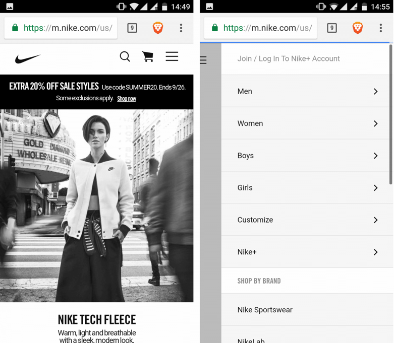
Nike uses this approach with their mobile application on m.nike.com. It differs from the desktop website by using only a static image instead of a video — this is clearly to save on bandwidth and hardware resources. The menu on top of the mobile page is also limited: it contains search, shopping cart, and the hamburger menu where you can access all necessary options from one place.
When you view an individual item on desktop there's a men/women menu on the left, which is not present on mobile. Instead, mobile users can tap the "Refine" link to access search customization options.
Other examples in this vein include m.facebook.com, mobile.twitter.com, or mobile.nytimes.com.
The same effect can be achieved without changing the URL – a completely redesigned and optimized version of the website is delivered seamlessly without changing the URL. All you really need to know is what device you are addressing before sending the content. This is where server-side device detection really shines.
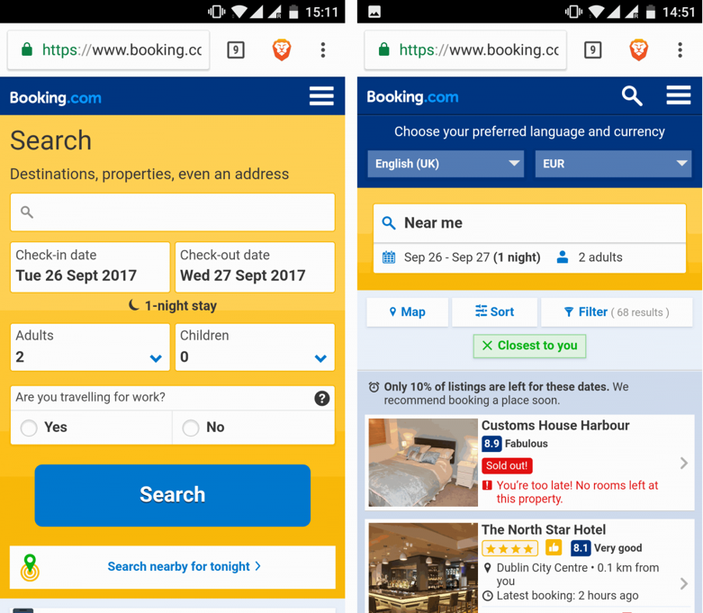
Booking.com, one of the biggest travel reservation sites in the world, uses this approach serving an adaptive design to its mobile users. The mobile version allows visitors to "Search nearby for tonight" using the user's location based on GPS or the current internet provider if GPS location is not available. The mobile app also has smaller menus, fewer promoted items, and smaller images.
The third option is to maintain the one-size-fits-all fluid layout including selected device-focused alterations where device detection is used to verify which components should and shouldn’t be served.
Possible adaptive optimizations to consider: UX and web performance
Each of these options for an adaptive configuration allows website owners to make arbitrary decisions on what content to display for different types of devices to best suit their capabilities and limitations addressing UX and web performance issues.
- Addressing user context and the phone’s capabilities
The space on mobile screens, even on massive phablets, is limited, which means that the website’s navigation must be optimized. A lot of businesses hide all menu items behind a hamburger menu to address screen size limitations but adaptive methodology allows for more granular optimization. Mobile users often have different goals and are in a different context than desktop users so it makes sense to focus on reordering, prioritizing and categorizing menu items in collapsible sections.
Some menu items may not even be present on low-end and mid-range phones where web performance should be the top priority. It’s similar for product filters on e-commerce sites, which take a lot of space on large screens and therefore may be omitted or limited on smaller screens.
It’s interesting to look at Amazon (amazon.co.uk) on different devices. There are at least five different versions of the site that you might get, depending on your device including a very basic experience for low-end users. What changes are menus, product filters, search, or promoted content sections on the home page.
A good example of implementing an adaptive technique is how Google serves different search results layouts depending on the device’s capabilities.
For local searches on smartphones tap-to-call phone numbers, directions, and Google Maps links are available. The related searches section at the bottom is completely redesigned with tappable links and a simple ‘next’ button instead of the iconic stretched Google logo and page numbers which would be too small to tap on mobile.
- Web performance
Web optimizations addressing web performance are equally important as they reduce the time it takes for a website to load on mobile, especially on low-end devices and slow connectivity. Website owners typically detect the screen width and height, input method, device type, or even available bandwidth, to selectively load content such as images, videos, animations, or scripts, which may reduce load times when served the same for all users.
- Addressing non-human visitors
Bots and crawlers may account for up to 50% of your mobile traffic according to a study by DeviceAtlas exposing websites to web performance issues related to excessive traffic and skewing web analytics reports. Any website outage or instability caused by the activity of bots and crawlers may result in a decrease in website loading time for end-users.
While entire content should be served to Googlebot or Bingbot, some non-human visitors can be detected and blocked completely from accessing the website or served a limited amount of content to save on bandwidth and ensure stability for human visitors.
Adaptive gives you flexibility
There are many tools in every web developer’s toolbox that can be used for mobile optimization that can boost user engagement and conversion rate on mobile so there’s no reason to limit yourself to only a few of them. Adaptive design is arguably the most flexible approach as the website owner is truly in control of how the UX on all devices caters to the user’s needs while, at the same time, improving user engagement and conversion rates.
Questions or comments?
Working with mobile optimization? DeviceAtlas provide the mobile device detection capability for Varnish, so please reach out if you have any questions or feedback. I’d love to hear from you.
For more insights on mobile web performance, device detection and the latest developments in the world of mobile devices, be sure to visit the DeviceAtlas blog.
...
Also, to learn more about what factors to consider in optimizing your site across devices to provide great user experiences even in peak traffic, don’t forget to register to attend the live Varnish webinar, “How to optimize your e-commerce website for online shoppers & conversion" on Thursday, 19 April at 4pm CEST / 10am EDT.