It’s no exaggeration to say that the internet has gone through tremendous changes since its birth three decades ago. In particular, the UI/UX space has undergone some drastic iterations, with the explosion of many different devices, screen sizes and their accompanying demands. To meet the needs of users across screens and devices, it’s more important than ever that we constantly improve our applications to ensure that regardless of device, users can still easily access and use the web application. And we cannot ignore that fact that things are still changing, and we need to keep learning and update in an ongoing way to provide better user experiences to our end users.
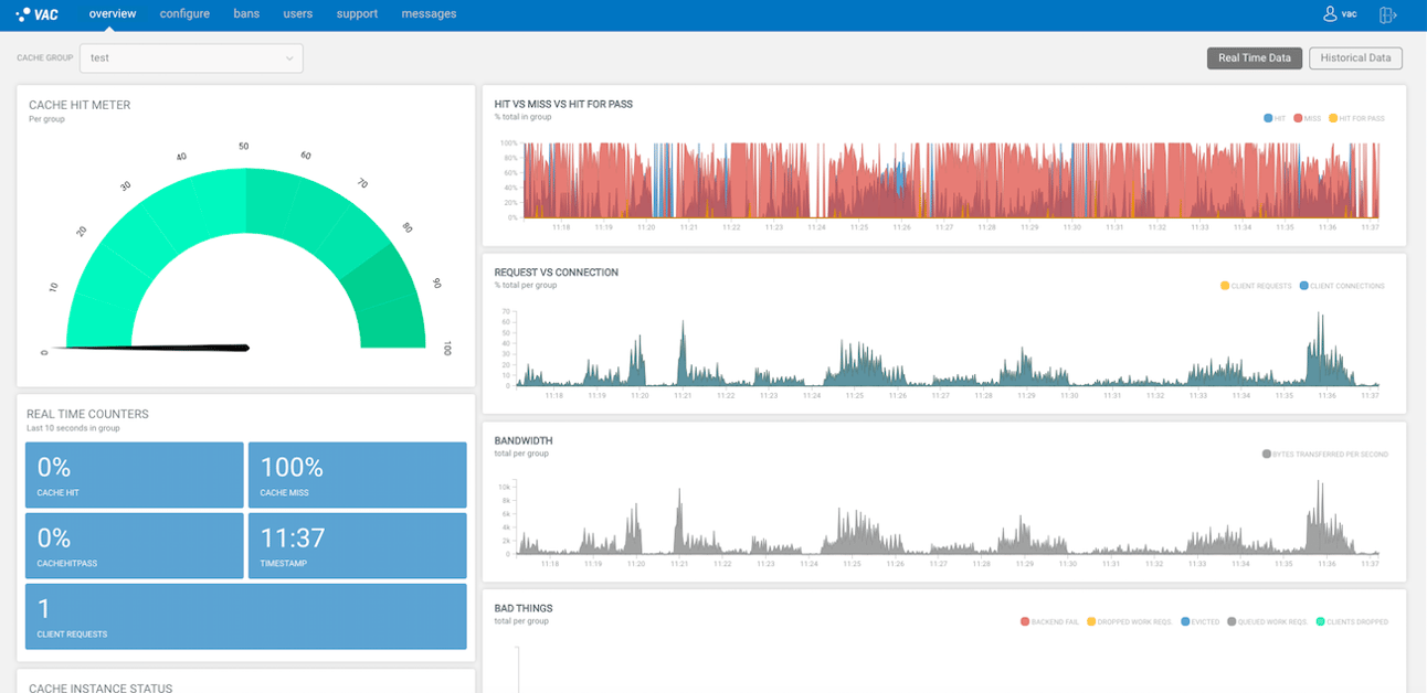
With that in mind the UI/UX of Varnish Administration Console (VAC) 3.7.0 has been updated to offer better user experiences to our customers. The VAC 3.7.0 is fully responsive and has some various improvements to create a more modern look and layout. It also comes with the systemd compliant packages for CENTOS / RHEL 7. Here we will look into these changes.
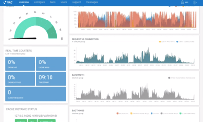
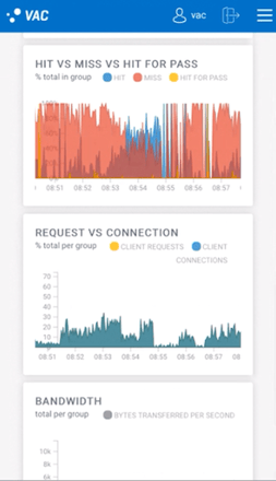
Now VAC can be accessed on any modern browser and real-time graphs on small devices can be scrolled along the x-axis. A responsive menu for the configuration page has been introduced for small devices.
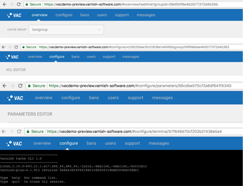
In the latest VAC we have made some improvements on URL patterns to make it easy to access different pages. New introduced URL patterns are:
- overview/realtime
- overview/historical
- overview/realtime?groupid=:ID
- overview/historical?groupid=:ID
- configure/vcl/:ID
- configure/vcl/:ID/group/:ID
- configure/parameters/:ID
- configure/terminal/nodeID
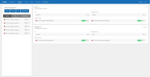
Drag and drop to add Cache Node, VCL and Parameter Sets has been replaced by context menu. Adding and Removing the Nodes, VCL and Parameters will automatically be saved and Save changes button has been removed.
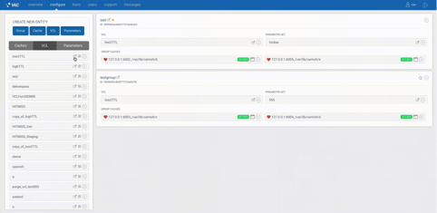
The Hit Miss graph has been removed from the configuration page to keep it simple.
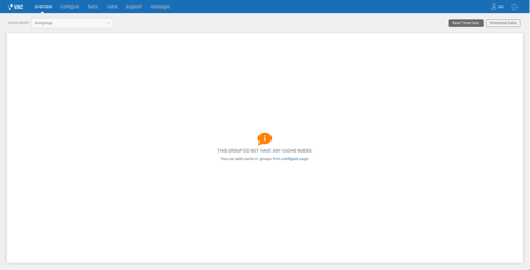
When there are no nodes and groups assigned to users they get proper information about what is missing.
In VAC 3.7.0 User with Admin role only can see the list of users and update the user information, user with User role can see the user setting page and can change their information and the user with Read-only role can see only see the user details.


Any thoughts on what we should include and improve in VAC? Or other ideas?
Photo by Vadim Sherbakov on Unsplash


